Partner Referral System
Sharing Leads and Profits
Project Context
Project Context
Registered Investment Advisors (RIA's) are a class of financial advisor with a fiduciary duty to provide sound advice. Amplify sought to partner with groups of RIA's as an additional channel to promote Indexed Universal Life (IUL) insurance policies. An RIA could either recommend an IUL policy to clients and let Amplify handle the sale, or share leads who were not a good fit for the rest of the RIA's services. Amplify could handle the details of an IUL sale and share the revenue with the referring partner.
Registered Investment Advisors (RIA's) are a class of financial advisor with a fiduciary duty to provide sound advice. Amplify sought to partner with groups of RIA's as an additional channel to promote Indexed Universal Life (IUL) insurance policies. An RIA could either recommend an IUL policy to clients and let Amplify handle the sale, or share leads who were not a good fit for the rest of the RIA's services. Amplify could handle the details of an IUL sale and share the revenue with the referring partner.
Task & Constraints
Task & Constraints
I was tasked with creating a portal for Registered Investment Advisors to send leads to Amplify. Their time is precious and they are reluctant to send leads to third parties, so the portal needed to be easy to use, and generate trust. Generating trust often involved displaying more relevant information, which required more input, which increased the cognitive load of the interface. Thus, a design challenge emerged.
I was tasked with creating a portal for Registered Investment Advisors to send leads to Amplify. Their time is precious and they are reluctant to send leads to third parties, so the portal needed to be easy to use, and generate trust. Generating trust often involved displaying more relevant information, which required more input, which increased the cognitive load of the interface. Thus, a design challenge emerged.
My Role
My Role
I interviewed RIAs to gain a picture of their needs, tools, and appetite for this type of product. I determined that there was little inherent desire to share leads, and in fact there was marginal opposition. The project was a priority for the company, so I created an interface to overcome as much opposition as possible, offering both a low-speed/high-reward path, and a high-speed/low reward path for sharing leads.
I interviewed RIAs to gain a picture of their needs, tools, and appetite for this type of product. I determined that there was little inherent desire to share leads, and in fact there was marginal opposition. The project was a priority for the company, so I created an interface to overcome as much opposition as possible, offering both a low-speed/high-reward path, and a high-speed/low reward path for sharing leads.
Outcome
Outcome
We launched the portal, allowing Registered Investment Advisors to send qualified leads to Amplify. They were protective of their clients and remained reluctant to share many leads, but this planted the seeds for cultivating long-term partnerships. It also set a precedent for industry partnerships in other areas, particularly white-labeling insurance sales administration software.
We launched the portal, allowing Registered Investment Advisors to send qualified leads to Amplify. They were protective of their clients and remained reluctant to share many leads, but this planted the seeds for cultivating long-term partnerships. It also set a precedent for industry partnerships in other areas, particularly white-labeling insurance sales administration software.
Partner Referral System
Sharing leads and profits
Success
Our partnered Registered Investment Advisors gained lead-sharing and profit-sharing, clients gained coverage, and Amplify set a precedent for itself in white-labeled software.
Success
Our partnered Registered Investment Advisors gained lead-sharing and profit-sharing, clients gained coverage, and Amplify set a precedent for itself in white-labeled software.
Below you will find a detailed breakdown of the RIA Partner Referral project, from beginning to end. The demo to the right shows the full prototype, based on the deliverable.
Research & Discovery
Research & Discovery
I interviewed several RIAs to understand their needs, tools, and appetite for a lead-share feature like this. Additionally, I was tasked with researching the field of "custodians" (effectively brokerages who work with RIA's to sell policies), to understand who the major players were and what features they offered. This project had the potential to compete with custodians or to or to become a white-labeled partner.
I interviewed several RIAs to understand their needs, tools, and appetite for a lead-share feature like this. Additionally, I was tasked with researching the field of "custodians" (effectively brokerages who work with RIA's to sell policies), to understand who the major players were and what features they offered. This project had the potential to compete with custodians or to or to become a white-labeled partner.
Carl
RIA at F4
5 advisors
Average client size is about $1 million
At least three are life insurance licensed.
He got licensed because at his former firm (Wirehouse for three years), it was a soft requirement. He wants to be a one-stop-shop for everyone who he works with.
He feels that having a working knowledge of the insurance world is important.
Evaluating life insurance needs for a client:
Early on - if working with a family who has dependents, they recommend it. Later, after they have fewer financial dependents, it may not be as necessary to pay that premium.
That tax-free inheritance is really nice for dependents.
He recommends term and perm depending on the needs. Younger folks have different needs. Most of his type of client can afford a permanent policy.
He marks in the documentation that they had the life insurance conversation.
He refers clients to an insurance specialist within their company most of the time.
Compensation structure: case by case. If a client is closet to him personally, then he will decline compensation for the referral. If it's more of a traditional sales pipeline he may take up to 10%.
[switching to first-person, as Carl]
When does the conversation happen?
Most clients have existing policies by the time we meet them. It is rare that we evaluate a policy for them. Insurance is one of the second or third conversations that we will have with someone. It is very important from a financial planning perspective. Ranges from 10x-20x for our clients. 10x is our absolute minimum if there are dependents.
Robert
RIA at MM Advisors
Centralized investment team, individual advisors selling.
~25 advisors
3 billion in assets
He works with younger folks: content creators, people in professional gaming space.
All are fiduciaries.
He came from the investment side. Started in Shanghai doing economic research, but moved progressively into being a comprehensive financial planner.
Insurance: he tries to get the "Goldilox" amount, not too little and not too much. Part of it is education, helping people understand what they do and don't need.
He joined Miracle Mile 6 months ago. Prior: NY-based RIA for 3.5 years. Prior: Shanghai research.
Folks at Miracle Mile are occasionally able to run quotes, but we are consistently looking for better rates.
We don't use a lot of universal life right now. We separate insurance from investments, so that the product is not doing both at once.
*** Are you insurance licensed today?
No I am not. One person on the NY team is, but we are not trying to get commission from them.
*** Have you sold it in the last 6 months?
Yes, as a part of the planning process, I do include that. My philosophy on insurance is that it must serve some insurance-based need: estate planning, etc. I can think of 5 examples in the last 2 months.
*** Of those 5 examples, which kind were those?
For the younger folks that I work with (30s-40s), they are all basically starting with term. We want to make sure that all of these policies are convertible to whole life at one point.
In one case, we advised a client to keep a whole life policy that her parents had purchased for her, but that was an exception. We did not sell it.
In cases where we are selling it: it's to a high net worth individual who is doing estate planning and looking to shelter against some estate taxes.
*** What is the process of selling it like today?
I work with the NY team, and I know that they work with several carriers. I'm guessing Mass Mutual, Prudential, some others. I know they look at others, but they almost never use them (like NW Mutual).
If there are better options elsewhere, we have them connect with insurance agents to get it done.
*** What percentage of the time does life insurance come up?
Zero percent of them bring it up. I bring it up 100% of the time.
Four layers:
Optimize income
Optimize assets
Protect income
Protect assets
When I'm bringing it up, most of the time I say "Life insurance exists, you'll need it some day. You don't need it today."
I bring it up when they are looking at parenthood. They are worried about being a parent, but know little about a will, a trust, etc. We ask "What would it mean for your kids if you were to stop working prematurely, if you wanted them to be educated through age 21?"
Sometimes we will do a ladder of policies, a 10 year, 20 year, 30 year.
*** What is the net worth of your clients?
Typically I work with minimum $500,000 in assets. Most advisors at the firm work with $3 million in assets minimum. Many of my peers are working with 9-figure clients.
*** Do you have a tool for financial planning?
We primarily use eMoney for that. It has many scenario planning tools, estate plan analysis.
The "Decision Center" runs projections around a person's entire life, and runs probability scenarios around it. i.e. What would happen if one spouse passes? etc.
*** Do customers push back against insurance if you recommend it?
Yes and no. Most people really recognize that we are fiduciaries looking out for their best interest. They respect that and trust us. Those who push back are probably a bit more risk-seeking. They see insurance as a waste of cost for not as much value. That's pretty uncommon, especially when they have a family.
The only other pushback point is on the cost side of things. Say I'm showing someone 2 different term policies, and one is slightly more expensive -- but it's convertible to whole life in the future and has a better rating, etc. -- I might say "It's worth spending extra time on this" but they won't care. Again, that's pretty rare.
When we are implementing a policy, we start with arming the client with as much information as possible. We are telling them exactly how much they need, if they need any health checks etc. We are looking to arm the client with the information so that they can work directly with the person who is going to place the policy. We try to be exact with policy type. I don't usually include riders for my clients, but one of my colleagues who works with people in their 50s-60s uses a lot of long-term care riders.
*** Have there been instances where people have been unable to get coverage?
There have been instances where people get delayed significantly in underwriting. We usually have a good idea about what the outcome will be as we are recommending a policy to them.
*** When are you recommending permanent products?
For me, it's rare. For my colleagues who have higher net worth clients, it is serving their trust and estate planning services.
I rarely consider mixing insurance and investment goals through the same product.
*** What are some of the tax-efficient investment products that you recommend?
A lot of them are business owners where we do a lot with retirement accounts. Some specialized qualified options like solar credits. For high-net worth people we recommend charitable accounts.
*** What part of the insurance process would you want to be updated on?
Certainly we ask for any in-force illustrations before they sign. We want to know what the quote is, what all the details are. I can't think of anything else. Since it is being done internally, I kind of trust our team to cover most of those steps.
*** With the internal team, are there things you wish could be improved?
This is a general statement: I think the biggest area would be the client experience. If the client could go do research on a website that didn't then try to send them 900 emails and sell their information to a ton of affiliates, that would be great. They should not have to wait on us to provide them with information.
We are not insurance sales people, nor do I want to be. I would certainly like for my clients to be more educated, and have the ability to gain that education on their own.
*** How do you feel about a digital insurance desk: get access to quotes, a policy, send a link to your clients to check it out?
That would be great. The industry is antiquated and opaque. It's obviously highly regulated, but it is unnecessarily difficult in many ways, "What do these words even mean?" Most people have a visceral reaction to the word "insurance", but even when they begin the research it's like "Forget it, this is too confusing."
If I and working with someone over the course of years, it is not always easy to log into whatever system they need to use in order to update their policy.
*** Do you have access to the cash value in their accounts?
Sometimes. eMoney has a feature that allows you to link accounts. Some carriers will allow you do to that.
Some people just let a whole life policy grow, while others are more active with it -- taking out loans against it, etc.
We need to track their progress in order to maintain records on their net worth.
*** Have you done any 1035 exchanges?
Yes have have done those. Most of the clients who come to us with life insurance are in the medical field, and were mis-sold policies as a resident. They have crazy premiums that forced them to choose between that or paying back loans. In those cases we surrender the policy altogether.
*** For the advisor VUL product that we are launching next year: the use-case would be for customers who have maxed out traditional tax-efficient channels. $2MM assets, maybe $250-750k.
What do you recommend for that type of client?
Totally depends on the goals of the client. Most often the case is putting that into taxable accounts as opposed to other tax-deferred vehicles, for the flexibility that affords, including the ability to potentially make it more tax efficient later on.
Most often, if a person wants to buy a house, start a business, etc. I tell them that they are far better off putting into a taxable account.
*** How often are these 1035 exchanges happening?
For clients in the medical field who got preyed upon as residents, it was common. That happens all the time in the medical field. With others it is much less frequent.
Most clients have little to no insurance, maybe a little through their employer.
*** How often are you using your internal person versus outsourcing altogether?
Typically if our person is getting involved, she's going to encourage them to find other quotes as well.
*** What does the interaction between yourself and the internal person look like?
Typically just a first intro meeting with her, myself and the client. After that, the client updates us on the process as it proceeds.
----
We haven't talked about this but a lot of my clients have a really bug need for disability insurance. My clients really don't know anything about that, especially in the entertainer/influencer space.
*** Would AUM fees be an incentive for you to recommend a universal policy?
It is an incentive for advisors for whom that is already a part of the plan. Everyone here is a CFP, CFA or both. So disclosing conflict of interest is ridiculously important. Any time there is an incentive for the advisor to recommend one product over another, that has to be disclosed, and there has to be a really good reason for recommending the more profitable one.
If the AUM fee presents a conflict, that would potentially generally complexity -- "Will this violate my conflict of interest policy with my client?" Trust is hard to gain, and ridiculously easy to lose.
Interview with Jason
Registered in FL, TX, and CA.
*** When do you recommend life insurance to business owners? (His client base is centered on business owners)
Before I build or maintain their portfolio I have an honest conversation about planning. We don't do anything until they have the plan laid out: estate, tax, and risk mitigation.
Say we have a plumber who is talented, has lots of clients, but doesn't have sophisticated business acumen. They may not understand the risk mitigation side of things.
You need insurance to protect against major loss. And you can take your savings and protect it in qualified channels.
*** How many insurance-licensed agents?
Both of us (the firm is small right now).
*** Do you outsource your insurance sales?
We work with a group out of NC ("Cason Group"). We put the idea down and they help structure it.
*** How do they design the product?
They design it based on out parameters and then hand it back.
If there was one request I could have, it would be for a more streamlined process. I want to sit down with my client and fill it all out. But insurance is still clunky, esp. when compared to the trading and custodial side.
*** Explanation of Amplify
I think you guys are right on point by using a fee-based model rather than commission-based. I want to be a true fiduciary -- which means fee-only -- but the insurance industry does not allow that. I have to explain to my clients that I cannot be fee-based when it comes to insurance, but that I would if I could.
*** We want to find fee-based managers -- wealth managers, RIA's, etc. who want that long-tail revenue stream rather than an immediate commission.
As RIA's we like that stable source of income rather than a lumpy style. Younger, hungrier people will want the up-front commission, but more seasoned RIAs know that AUM is better in the long run.
*** Can you tell me about the last few customers that you sold insurance to?
The most recent was a $1MM split-dollar plan to get a lot of dollars behind a tax screen. LIRP was involved.
The other was for a widow who had low financial knowledge. Her husband had taken care of the finances. We were able to guarantee some income for her.
Insurance comes up for every client who we work with. We use a financial planning tool called "Right Capital" which is similar to "eMoney" ("Black Diamond" is another product). We start with the software's recommendation, and then customize it for the client.
We tell clients to put the risk on the insurance company for any major events that could result in a liquidity problem for them.
*** Where does the insurance recommendation process start and end? What do you outsource?
Having done this for a while, I've got a sense of which carriers are going to be the best. After meeting with a client, we set up a call with Cason group in NC. From there, they put together a package for us, and take that to certain carriers to make sure we are competitive. We do not bring Cason group to a client call, we just outsource some of the work.
*** Do your clients go through underwriting with multiple carriers?
Sometimes multiple. One carrier may not have everything a client needs.
Company "Altruist" -- Problem was that the paperwork took three weeks to finish and then it would come back NIGO. But they streamlined it all and made it digital. They took all of these sticky pain points for custodial processes and started knocking them out one by one. I'd love to see that happen on the insurance side.
My approach is a "service model". I'm not trying to gather a volume of clients. I'm not trying to do exotic, complex investing. My angle is service. I want my value to be seamless service.
But if the client has to walk through a ton of platforms, they may wonder why they are even paying a financial advisor.
I want to limit the client's ability to change things. If they go in, and change a lot of numbers, that could undo hours of work. The down side of that is that they sometimes feel like they need to "ask permission" to use their own money.
*** What products are you recommending for your clients?
In general, it's VUL. Sometimes IUL, but that is less flexible.
*** What determines which one you recommend?
It depends on the client, the risk tolerance, and the product. Whole life was rarely an option because of the poor nature of the product.
Clients who are in retirement have very different risk tolerance compared to younger people.
*** How do you manage these VUL investments today?
With Jackson, there is a portal that we can use to manage the product.
*** What tools do you use?
Altruist, Jackson's portal, Wealthbox.
Altruist takes a ton of work off of my plate. For example, on any trade or transaction, I would have to take notes on what I did and relay those to the client. But the platform takes care of that.
We can now place trades in their 401(k) and even charge a fee for that.
If you could show the Amplify platform data within an existing one, that would be ideal. Clients do not like to log into a lot of different platforms.
Devon’s RIA Custodian Context Research
Top Tier Custodians
Schwab
Largest, oldest
Lowest fees due to highest economy of scale
Fidelity
Emphasizes proprietary "Wealthscape" platform (rooted in their purchase of 'eMoney Advisor').
A more unified "set it and forget it" tech ecosystem.
TD Ameritrade
More open tech environment, less emphasis on their own proprietary software.
Customizable ecosystem, integrated with more APIs.
Pershing
Focuses on largest RIAs with ultra-high net worth, $100's of millions
Second Tier Custodians
10-100x smaller than one of the big four
More expensive due to less economy of scale
More focused on a niche, seeking to fit extremely well with certain types of advisors.
Most do not have a retail segment that could potentially compete with the RIA's they serve.
SSG
https://www.ssginstitutional.com/
Built on top of Pershings
Rare: no asset minimum required to join the platform (the big 4 have aset minimums in the 10's of milions)
More expensive in terms of ticket costs and other feeds
Startup friendly
Trade PMR
Emphasis on technology
RIAs can manage accounts almost entirely on a mobile device
"Fusion" platform has a dashboard based highly on Windows.
Trust Company of America / Axos
"Liberty" platform for portfolio management, is also white-label-able
Good for "turnkey asset management" specializing in model portfolios
Folio Institutional
Can handle fractional shares
More API integration than most others
Apex Clearing
Most technologically capable. (Real-time validation for "Not in Good Order" paperwork, rather than waiting a few days for the NIGO notice.)
A network of APIs that provide services through other interfaces.
Millenium Trust
Emphasizes nontraditional assets
National Advisors Trust
RIA custodian co-op, most RIA's become shareholders.
Carl
RIA at F4
5 advisors
Average client size is about $1 million
At least three are life insurance licensed.
He got licensed because at his former firm (Wirehouse for three years), it was a soft requirement. He wants to be a one-stop-shop for everyone who he works with.
He feels that having a working knowledge of the insurance world is important.
Evaluating life insurance needs for a client:
Early on - if working with a family who has dependents, they recommend it. Later, after they have fewer financial dependents, it may not be as necessary to pay that premium.
That tax-free inheritance is really nice for dependents.
He recommends term and perm depending on the needs. Younger folks have different needs. Most of his type of client can afford a permanent policy.
He marks in the documentation that they had the life insurance conversation.
He refers clients to an insurance specialist within their company most of the time.
Compensation structure: case by case. If a client is closet to him personally, then he will decline compensation for the referral. If it's more of a traditional sales pipeline he may take up to 10%.
[switching to first-person, as Carl]
When does the conversation happen?
Most clients have existing policies by the time we meet them. It is rare that we evaluate a policy for them. Insurance is one of the second or third conversations that we will have with someone. It is very important from a financial planning perspective. Ranges from 10x-20x for our clients. 10x is our absolute minimum if there are dependents.
Robert
RIA at MM Advisors
Centralized investment team, individual advisors selling.
~25 advisors
3 billion in assets
He works with younger folks: content creators, people in professional gaming space.
All are fiduciaries.
He came from the investment side. Started in Shanghai doing economic research, but moved progressively into being a comprehensive financial planner.
Insurance: he tries to get the "Goldilox" amount, not too little and not too much. Part of it is education, helping people understand what they do and don't need.
He joined Miracle Mile 6 months ago. Prior: NY-based RIA for 3.5 years. Prior: Shanghai research.
Folks at Miracle Mile are occasionally able to run quotes, but we are consistently looking for better rates.
We don't use a lot of universal life right now. We separate insurance from investments, so that the product is not doing both at once.
*** Are you insurance licensed today?
No I am not. One person on the NY team is, but we are not trying to get commission from them.
*** Have you sold it in the last 6 months?
Yes, as a part of the planning process, I do include that. My philosophy on insurance is that it must serve some insurance-based need: estate planning, etc. I can think of 5 examples in the last 2 months.
*** Of those 5 examples, which kind were those?
For the younger folks that I work with (30s-40s), they are all basically starting with term. We want to make sure that all of these policies are convertible to whole life at one point.
In one case, we advised a client to keep a whole life policy that her parents had purchased for her, but that was an exception. We did not sell it.
In cases where we are selling it: it's to a high net worth individual who is doing estate planning and looking to shelter against some estate taxes.
*** What is the process of selling it like today?
I work with the NY team, and I know that they work with several carriers. I'm guessing Mass Mutual, Prudential, some others. I know they look at others, but they almost never use them (like NW Mutual).
If there are better options elsewhere, we have them connect with insurance agents to get it done.
*** What percentage of the time does life insurance come up?
Zero percent of them bring it up. I bring it up 100% of the time.
Four layers:
Optimize income
Optimize assets
Protect income
Protect assets
When I'm bringing it up, most of the time I say "Life insurance exists, you'll need it some day. You don't need it today."
I bring it up when they are looking at parenthood. They are worried about being a parent, but know little about a will, a trust, etc. We ask "What would it mean for your kids if you were to stop working prematurely, if you wanted them to be educated through age 21?"
Sometimes we will do a ladder of policies, a 10 year, 20 year, 30 year.
*** What is the net worth of your clients?
Typically I work with minimum $500,000 in assets. Most advisors at the firm work with $3 million in assets minimum. Many of my peers are working with 9-figure clients.
*** Do you have a tool for financial planning?
We primarily use eMoney for that. It has many scenario planning tools, estate plan analysis.
The "Decision Center" runs projections around a person's entire life, and runs probability scenarios around it. i.e. What would happen if one spouse passes? etc.
*** Do customers push back against insurance if you recommend it?
Yes and no. Most people really recognize that we are fiduciaries looking out for their best interest. They respect that and trust us. Those who push back are probably a bit more risk-seeking. They see insurance as a waste of cost for not as much value. That's pretty uncommon, especially when they have a family.
The only other pushback point is on the cost side of things. Say I'm showing someone 2 different term policies, and one is slightly more expensive -- but it's convertible to whole life in the future and has a better rating, etc. -- I might say "It's worth spending extra time on this" but they won't care. Again, that's pretty rare.
When we are implementing a policy, we start with arming the client with as much information as possible. We are telling them exactly how much they need, if they need any health checks etc. We are looking to arm the client with the information so that they can work directly with the person who is going to place the policy. We try to be exact with policy type. I don't usually include riders for my clients, but one of my colleagues who works with people in their 50s-60s uses a lot of long-term care riders.
*** Have there been instances where people have been unable to get coverage?
There have been instances where people get delayed significantly in underwriting. We usually have a good idea about what the outcome will be as we are recommending a policy to them.
*** When are you recommending permanent products?
For me, it's rare. For my colleagues who have higher net worth clients, it is serving their trust and estate planning services.
I rarely consider mixing insurance and investment goals through the same product.
*** What are some of the tax-efficient investment products that you recommend?
A lot of them are business owners where we do a lot with retirement accounts. Some specialized qualified options like solar credits. For high-net worth people we recommend charitable accounts.
*** What part of the insurance process would you want to be updated on?
Certainly we ask for any in-force illustrations before they sign. We want to know what the quote is, what all the details are. I can't think of anything else. Since it is being done internally, I kind of trust our team to cover most of those steps.
*** With the internal team, are there things you wish could be improved?
This is a general statement: I think the biggest area would be the client experience. If the client could go do research on a website that didn't then try to send them 900 emails and sell their information to a ton of affiliates, that would be great. They should not have to wait on us to provide them with information.
We are not insurance sales people, nor do I want to be. I would certainly like for my clients to be more educated, and have the ability to gain that education on their own.
*** How do you feel about a digital insurance desk: get access to quotes, a policy, send a link to your clients to check it out?
That would be great. The industry is antiquated and opaque. It's obviously highly regulated, but it is unnecessarily difficult in many ways, "What do these words even mean?" Most people have a visceral reaction to the word "insurance", but even when they begin the research it's like "Forget it, this is too confusing."
If I and working with someone over the course of years, it is not always easy to log into whatever system they need to use in order to update their policy.
*** Do you have access to the cash value in their accounts?
Sometimes. eMoney has a feature that allows you to link accounts. Some carriers will allow you do to that.
Some people just let a whole life policy grow, while others are more active with it -- taking out loans against it, etc.
We need to track their progress in order to maintain records on their net worth.
*** Have you done any 1035 exchanges?
Yes have have done those. Most of the clients who come to us with life insurance are in the medical field, and were mis-sold policies as a resident. They have crazy premiums that forced them to choose between that or paying back loans. In those cases we surrender the policy altogether.
*** For the advisor VUL product that we are launching next year: the use-case would be for customers who have maxed out traditional tax-efficient channels. $2MM assets, maybe $250-750k.
What do you recommend for that type of client?
Totally depends on the goals of the client. Most often the case is putting that into taxable accounts as opposed to other tax-deferred vehicles, for the flexibility that affords, including the ability to potentially make it more tax efficient later on.
Most often, if a person wants to buy a house, start a business, etc. I tell them that they are far better off putting into a taxable account.
*** How often are these 1035 exchanges happening?
For clients in the medical field who got preyed upon as residents, it was common. That happens all the time in the medical field. With others it is much less frequent.
Most clients have little to no insurance, maybe a little through their employer.
*** How often are you using your internal person versus outsourcing altogether?
Typically if our person is getting involved, she's going to encourage them to find other quotes as well.
*** What does the interaction between yourself and the internal person look like?
Typically just a first intro meeting with her, myself and the client. After that, the client updates us on the process as it proceeds.
----
We haven't talked about this but a lot of my clients have a really bug need for disability insurance. My clients really don't know anything about that, especially in the entertainer/influencer space.
*** Would AUM fees be an incentive for you to recommend a universal policy?
It is an incentive for advisors for whom that is already a part of the plan. Everyone here is a CFP, CFA or both. So disclosing conflict of interest is ridiculously important. Any time there is an incentive for the advisor to recommend one product over another, that has to be disclosed, and there has to be a really good reason for recommending the more profitable one.
If the AUM fee presents a conflict, that would potentially generally complexity -- "Will this violate my conflict of interest policy with my client?" Trust is hard to gain, and ridiculously easy to lose.
Interview with Jason
Registered in FL, TX, and CA.
*** When do you recommend life insurance to business owners? (His client base is centered on business owners)
Before I build or maintain their portfolio I have an honest conversation about planning. We don't do anything until they have the plan laid out: estate, tax, and risk mitigation.
Say we have a plumber who is talented, has lots of clients, but doesn't have sophisticated business acumen. They may not understand the risk mitigation side of things.
You need insurance to protect against major loss. And you can take your savings and protect it in qualified channels.
*** How many insurance-licensed agents?
Both of us (the firm is small right now).
*** Do you outsource your insurance sales?
We work with a group out of NC ("Cason Group"). We put the idea down and they help structure it.
*** How do they design the product?
They design it based on out parameters and then hand it back.
If there was one request I could have, it would be for a more streamlined process. I want to sit down with my client and fill it all out. But insurance is still clunky, esp. when compared to the trading and custodial side.
*** Explanation of Amplify
I think you guys are right on point by using a fee-based model rather than commission-based. I want to be a true fiduciary -- which means fee-only -- but the insurance industry does not allow that. I have to explain to my clients that I cannot be fee-based when it comes to insurance, but that I would if I could.
*** We want to find fee-based managers -- wealth managers, RIA's, etc. who want that long-tail revenue stream rather than an immediate commission.
As RIA's we like that stable source of income rather than a lumpy style. Younger, hungrier people will want the up-front commission, but more seasoned RIAs know that AUM is better in the long run.
*** Can you tell me about the last few customers that you sold insurance to?
The most recent was a $1MM split-dollar plan to get a lot of dollars behind a tax screen. LIRP was involved.
The other was for a widow who had low financial knowledge. Her husband had taken care of the finances. We were able to guarantee some income for her.
Insurance comes up for every client who we work with. We use a financial planning tool called "Right Capital" which is similar to "eMoney" ("Black Diamond" is another product). We start with the software's recommendation, and then customize it for the client.
We tell clients to put the risk on the insurance company for any major events that could result in a liquidity problem for them.
*** Where does the insurance recommendation process start and end? What do you outsource?
Having done this for a while, I've got a sense of which carriers are going to be the best. After meeting with a client, we set up a call with Cason group in NC. From there, they put together a package for us, and take that to certain carriers to make sure we are competitive. We do not bring Cason group to a client call, we just outsource some of the work.
*** Do your clients go through underwriting with multiple carriers?
Sometimes multiple. One carrier may not have everything a client needs.
Company "Altruist" -- Problem was that the paperwork took three weeks to finish and then it would come back NIGO. But they streamlined it all and made it digital. They took all of these sticky pain points for custodial processes and started knocking them out one by one. I'd love to see that happen on the insurance side.
My approach is a "service model". I'm not trying to gather a volume of clients. I'm not trying to do exotic, complex investing. My angle is service. I want my value to be seamless service.
But if the client has to walk through a ton of platforms, they may wonder why they are even paying a financial advisor.
I want to limit the client's ability to change things. If they go in, and change a lot of numbers, that could undo hours of work. The down side of that is that they sometimes feel like they need to "ask permission" to use their own money.
*** What products are you recommending for your clients?
In general, it's VUL. Sometimes IUL, but that is less flexible.
*** What determines which one you recommend?
It depends on the client, the risk tolerance, and the product. Whole life was rarely an option because of the poor nature of the product.
Clients who are in retirement have very different risk tolerance compared to younger people.
*** How do you manage these VUL investments today?
With Jackson, there is a portal that we can use to manage the product.
*** What tools do you use?
Altruist, Jackson's portal, Wealthbox.
Altruist takes a ton of work off of my plate. For example, on any trade or transaction, I would have to take notes on what I did and relay those to the client. But the platform takes care of that.
We can now place trades in their 401(k) and even charge a fee for that.
If you could show the Amplify platform data within an existing one, that would be ideal. Clients do not like to log into a lot of different platforms.
Devon’s RIA Custodian Context Research
Top Tier Custodians
Schwab
Largest, oldest
Lowest fees due to highest economy of scale
Fidelity
Emphasizes proprietary "Wealthscape" platform (rooted in their purchase of 'eMoney Advisor').
A more unified "set it and forget it" tech ecosystem.
TD Ameritrade
More open tech environment, less emphasis on their own proprietary software.
Customizable ecosystem, integrated with more APIs.
Pershing
Focuses on largest RIAs with ultra-high net worth, $100's of millions
Second Tier Custodians
10-100x smaller than one of the big four
More expensive due to less economy of scale
More focused on a niche, seeking to fit extremely well with certain types of advisors.
Most do not have a retail segment that could potentially compete with the RIA's they serve.
SSG
https://www.ssginstitutional.com/
Built on top of Pershings
Rare: no asset minimum required to join the platform (the big 4 have aset minimums in the 10's of milions)
More expensive in terms of ticket costs and other feeds
Startup friendly
Trade PMR
Emphasis on technology
RIAs can manage accounts almost entirely on a mobile device
"Fusion" platform has a dashboard based highly on Windows.
Trust Company of America / Axos
"Liberty" platform for portfolio management, is also white-label-able
Good for "turnkey asset management" specializing in model portfolios
Folio Institutional
Can handle fractional shares
More API integration than most others
Apex Clearing
Most technologically capable. (Real-time validation for "Not in Good Order" paperwork, rather than waiting a few days for the NIGO notice.)
A network of APIs that provide services through other interfaces.
Millenium Trust
Emphasizes nontraditional assets
National Advisors Trust
RIA custodian co-op, most RIA's become shareholders.

User Journey
Incorporating all of our research, the PMs and I built a user journey map, seen from the perspective of the user (in this case an RIA). The first section was ultimately delegated to Marketing. The rest of the scope was massive, and progressively broken into smaller pieces. The first phase tackled sections 2-4 ("Begin with Amplify" through "Administer Clients") and for this porfolio I am focusing on "Create Applications".
Goals and Incentives
Goals and Incentives
Low Trust
Low Trust
The more information an RIA provided about a lead, the higher the chance of a sale, and thus a mutually beneficial profit-share. But they needed to trust us first and see the effort as worthwhile. Some interviewees expressed unwillingness to recommend IUL as a product. In order to positively influence these potential partners, the interface needed to be transparent, clearly displaying the policy details and any benefits to their clients. Above all, Amplify needed to preserve their reputation as advisors.
The more information an RIA provided about a lead, the higher the chance of a sale, and thus a mutually beneficial profit-share. But they needed to trust us first and see the effort as worthwhile. Some interviewees expressed unwillingness to recommend IUL as a product. In order to positively influence these potential partners, the interface needed to be transparent, clearly displaying the policy details and any benefits to their clients. Above all, Amplify needed to preserve their reputation as advisors.
Low Time
Low Time
An RIA would potentially spend time sending leads for a chance at extra income, but not if the process was too time-intensive. Still, the more information Amplify had about incoming leads, the greater the chance of closing the deal. I needed to design an interface that helped RIA's understand the payoff and spend their time efficiently.
An RIA would potentially spend time sending leads for a chance at extra income, but not if the process was too time-intensive. Still, the more information Amplify had about incoming leads, the greater the chance of closing the deal. I needed to design an interface that helped RIA's understand the payoff and spend their time efficiently.

Concentric Target Model
Illustrates that higher chances of obtaining value also require higher workloads as input.

Linear Model
Illustrates the progressive nature of information and thus lead types, and helps classify categories of lead.
true partnership
I needed to design an interface that helped RIA's understand the payoff and spend their time efficiently.
true partnership
I needed to design an interface that helped RIA's understand the payoff and spend their time efficiently.
RIA-Side: Patterns & Collaboration
Patterns &
Cross-Team Collaboration
RIA-Side: Patterns & Collaboration
The goal here was to encourage RIA's to send as many leads as possible, with as much information about each lead as possible. There was a limit to how much we could expect, but the interface could help. We needed to walk a line between asking for information versus making the process feel swift and efficient.
The goal here was to encourage RIA's to send as many leads as possible, with as much information about each lead as possible. There was a limit to how much we could expect, but the interface could help. We needed to walk a line between asking for information versus making the process feel swift and efficient.
Pattern: Modal
Pattern: Modal
Initially I explored modals as a means of making the interface feel "quick". Modals are associated with temporary activity, so placing the questionnaire within one could lead an RIA to feel that it was more lightweight.
Initially I explored modals as a means of making the interface feel "quick". Modals are associated with temporary activity, so placing the questionnaire within one could lead an RIA to feel that it was more lightweight.
Pattern: Page Progression
Pattern: Page Progression
After getting feedback from stakeholders in leadership, it became apparent that we were going to ask for as much information as possible. A modal would feel too heavy if a user needed to scroll to use it, so I opted for a page progression instead. Additionally, with the large number of proposed questions, I advocated for a "quick referral" path to be included in the design, which would include a subset of questions for those in a hurry.
After getting feedback from stakeholders in leadership, it became apparent that we were going to ask for as much information as possible. A modal would feel too heavy if a user needed to scroll to use it, so I opted for a page progression instead. Additionally, with the large number of proposed questions, I advocated for a "quick referral" path to be included in the design, which would include a subset of questions for those in a hurry.

User Journey Becomes Workflow
Here I have used the User Journey Map to begin building a workflow for the RIA and the referred client, including prototype connectors.

Draft of Combination Coverage
Notes for engineering are working to catch edge cases and provide clear specs.

Draft of IUL Coverage
Does not include the "Term" portion, slightly simplifying a complex page.

Early Draft: Modal
I explored using a modal, but decided to progress with pages instead, as the number of questions would exceed reasonable capacity for a modal experience.
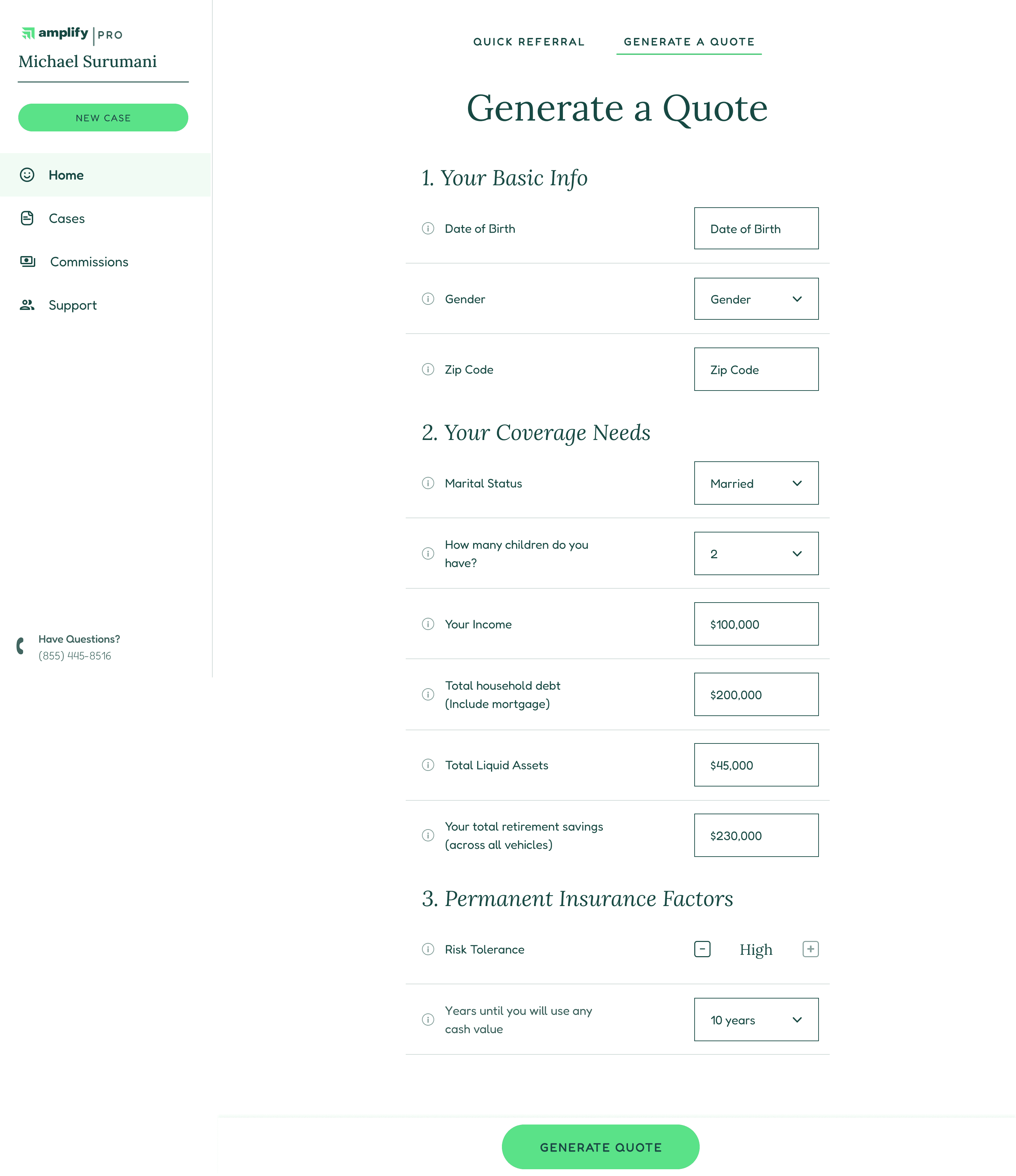
Updated Draft Based on Stakeholder Input
After additional communication, I incorporated stakeholder input to create a more comprehensive questionnaire. The benefits section would have its own dedicated page.
Client-Side: Patterns and Collaboration
Client-Side: Patterns and Collaboration
Client-Side Experience
Client-Side Experience
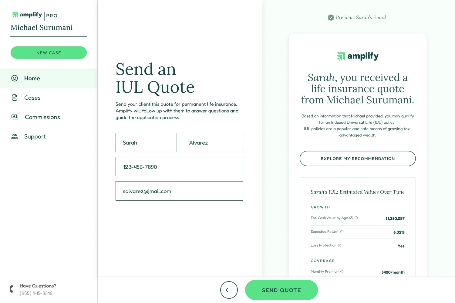
The workflow needed to include not only RIA's, but the clients they referred to Amplify. Our goals were to build trust with RIA's through a positive client experience, and for clients to complete the application process, leading to a sale. I designed the client experience as a streamlined version of our application, and encouraged engagement by customizing the screen with their name, as well as displaying a partially-filled progress bar.
The workflow needed to include not only RIA's, but the clients they referred to Amplify. Our goals were to build trust with RIA's through a positive client experience, and for clients to complete the application process, leading to a sale. I designed the client experience as a streamlined version of our application, and encouraged engagement by customizing the screen with their name, as well as displaying a partially-filled progress bar.
Partner Transparency
Partner Transparency
To help RIA's trust Amplify with their leads, we provided them with a timeline and a preview of the client experience. It was important for our partner advisors to know that we would contact their leads quickly and that we had a plan for the sales process.
To help RIA's trust Amplify with their leads, we provided them with a timeline and a preview of the client experience. It was important for our partner advisors to know that we would contact their leads quickly and that we had a plan for the sales process.
Patterns: Rapid Value and Inherited Progress
Patterns: Rapid Value and Inherited Progress
In order to incentivize clients to follow through with applications, I incorporated both a rapid value-feedback-loop and inherited progress. After clicking through from an email, they are quickly presented with value in the form of policy details. After completing a few additional questions, they receive a quote. Additionally, the CTA reads "Complete My Application" (rather than "Begin"), and the progress indicator displays "20% complete" from the very start. Providing such "inherited progress" encourages users to complete labor-intensive processes.
In order to incentivize clients to follow through with applications, I incorporated both a rapid value-feedback-loop and inherited progress. After clicking through from an email, they are quickly presented with value in the form of policy details. After completing a few additional questions, they receive a quote. Additionally, the CTA reads "Complete My Application" (rather than "Begin"), and the progress indicator displays "20% complete" from the very start. Providing such "inherited progress" encourages users to complete labor-intensive processes.
Draft A: RIA Preview of Client Experience
To build trust, we wanted the entire process to be transparent.

Draft B: RIA Preview of Client Experience
Stakeholders asked for more of the client experience timeline.

Client Side: Initial Clickthrough
Displaying both immediate value and inherited progress.

Client Side: Completing Application
Progress indicator fills to 20% on page load.
Engineering Sanity Check
I created this Figma prototype as a way to help engineers understand one of the primary flows, and to check for blind spots early in the process.
focus on engagement
I promoted engagement by including the client's name and utilizing inherited progress.
focus on engagement
I promoted engagement by including the client's name and utilizing inherited progress.
Delivery & Meta
Delivery & Meta
Delivery
Delivery
Deliverable Format: Figma link.
Structure: I designed the interface largely using the Style and Component library that I created and maintained for the Product team (pulling in many contributions from others), which is based on the atomic framework. Engineering maintains a copy on their end.
Deliverable Format: Figma link.
Structure: I designed the interface largely using the Style and Component library that I created and maintained for the Product team (pulling in many contributions from others), which is based on the atomic framework. Engineering maintains a copy on their end.
Specs and Instructions
Specs and Instructions
Reducing engineering lift and helping with clean execution means not just designing with modularity, but leaving clear instructions. I left annotations throughout the deliverable to assist engineers in execution. The metric of success here is to have as few questions as possible after delivery. Where necessary, I mocked up animations to demo behavior.
Examples:
In the "education" section of the project (scope not covered above), I included a micro-interaction to provide feedback on copying an article.
In the "client administration" section of the project (scope not covered above), I included detailed dropdowns and overlays for speedy execution.

Microinteraction
Takes into account the feedback experience in copying an article link.

Complete Specs
Providing engineers with complete specs increases efficiency.
Final Outcome
Final Outcome
The end result allows RIA's to partner with Amplify, sharing leads and generating extra (largely passive) profits. The scope of this project started out as massive, and was reduced to merely enormous. I am proud of how user research led to a user journey map, which led directly to workflows in the interface. We provided our partners with an intuitive interface that nevertheless displays complex data. And it provides all referred clients with a clear and easy path to apply for life insurance.
The end result allows RIA's to partner with Amplify, sharing leads and generating extra (largely passive) profits. The scope of this project started out as massive, and was reduced to merely enormous. I am proud of how user research led to a user journey map, which led directly to workflows in the interface. We provided our partners with an intuitive interface that nevertheless displays complex data. And it provides all referred clients with a clear and easy path to apply for life insurance.
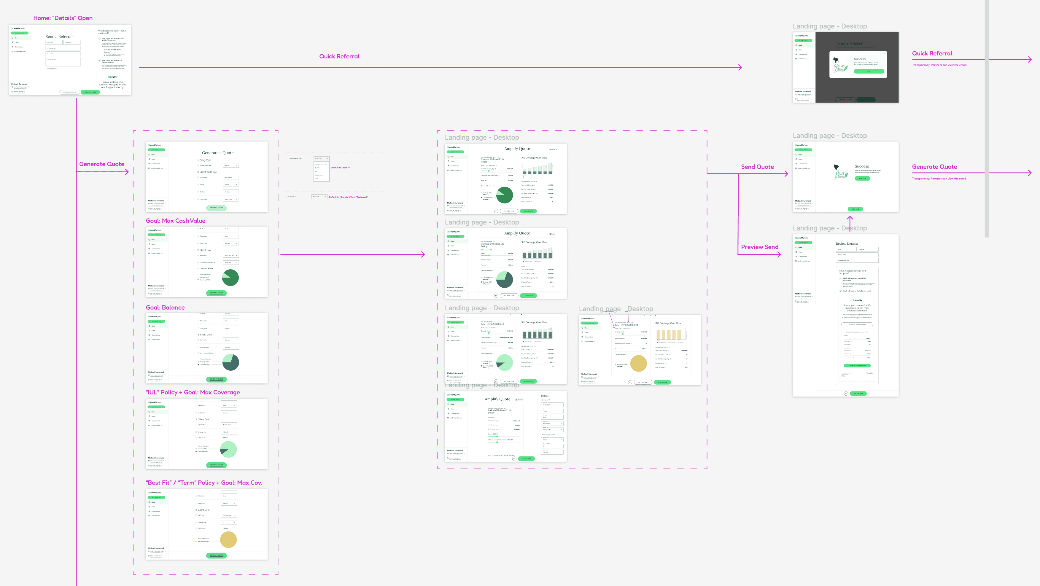
Figma Deliverable
This is a section of the final deliverable, covering the complex "Quoting" functionality.
Future Opportunities
Future Opportunities
Odds and Predictions
Odds and Predictions
It would have been interesting to include live-updating "odds of closing a deal" and "predicted income over time" metrics that increased as an RIA provided higher amounts of information about each lead.
It would have been interesting to include live-updating "odds of closing a deal" and "predicted income over time" metrics that increased as an RIA provided higher amounts of information about each lead.
Client Path Updates
Client Path Updates
I liked the aesthetic of the client path in this project, and I would consider A/B testing it in the main walkthrough to see if it increased conversion.
I liked the aesthetic of the client path in this project, and I would consider A/B testing it in the main walkthrough to see if it increased conversion.