OnePay
A Self-Initiated Design Demo Addressing the Consumer Debt Crisis
Project Context
Project Context
I wanted to create a small design demo unbounded by the constraints of a typical product development pipeline. I also wanted the project to have meaningful context, so I considered how design might be leveraged to improve people's financial situations. Consumer debt in the United States is producing a dangerous cycle of poverty, and the general population is under-educated about the fundamentals of efficient repayment. Without the ability to strategically allocate their repayments, many people are accruing deep deficits that they struggle to repay. Thus, consumer credit card debt became the focus of the project.
I wanted to create a small design demo unbounded by the constraints of a typical product development pipeline. I also wanted the project to have meaningful context, so I considered how design might be leveraged to improve people's financial situations. Consumer debt in the United States is producing a dangerous cycle of poverty, and the general population is under-educated about the fundamentals of efficient repayment. Without the ability to strategically allocate their repayments, many people are accruing deep deficits that they struggle to repay. Thus, consumer credit card debt became the focus of the project.
Task & Constraints
Task & Constraints
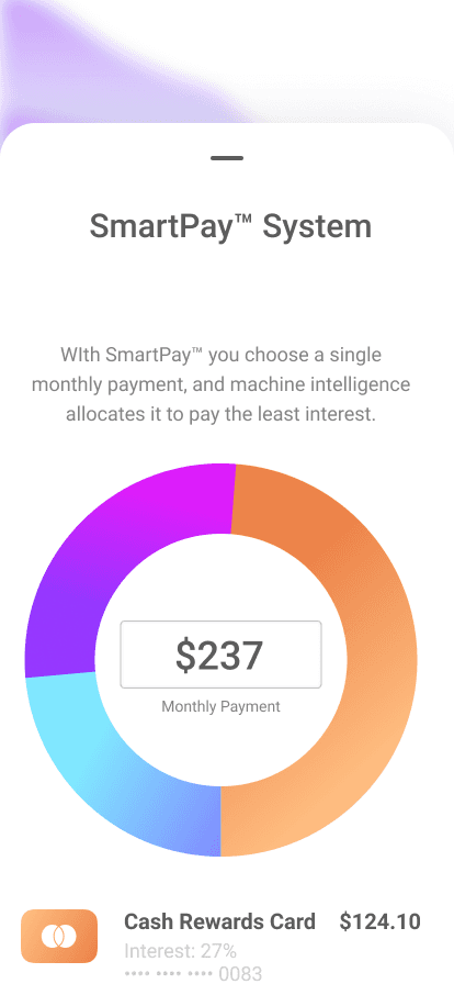
I set about imagining a piece of software that could easily assist people with credit card debt in particular. The initial idea was to simplify credit payment patterns, allowing people to intuitively understand when their bills were due, and how to avoid paying interest. After researching the financial patterns of those who accrue credit card debt, however, I noticed that my strategy was still too complex. The app needed to boil every variable down to one number: one payment per month. The user makes the payment, and the software decides where to allocate it.
I set about imagining a piece of software that could easily assist people with credit card debt in particular. The initial idea was to simplify credit payment patterns, allowing people to intuitively understand when their bills were due, and how to avoid paying interest. After researching the financial patterns of those who accrue credit card debt, however, I noticed that my strategy was still too complex. The app needed to boil every variable down to one number: one payment per month. The user makes the payment, and the software decides where to allocate it.
My Role
My Role
As a self-initiated design demo, I created every aspect of this project. In keeping with the mandate for simplicity and ease of use, I worked through several iterations. I sketched, designed, and simplified the hierarchy, navigation and architecture. Because interacting with credit lending institutions can be intimidating for consumers, I chose to bring a sense of levity to the experience: using a bright and highly saturated complimentary color scheme, as well as animations with greater bounce easing than would be typical of a financial app. I built the designs in Figma and animated them in After Effects.
As a self-initiated design demo, I created every aspect of this project. In keeping with the mandate for simplicity and ease of use, I worked through several iterations. I sketched, designed, and simplified the hierarchy, navigation and architecture. Because interacting with credit lending institutions can be intimidating for consumers, I chose to bring a sense of levity to the experience: using a bright and highly saturated complimentary color scheme, as well as animations with greater bounce easing than would be typical of a financial app. I built the designs in Figma and animated them in After Effects.
Outcome
Outcome
The OnePay demo demonstrates that a serious financial tool can also be beautiful and consumer-friendly. The interface simply prioritizes the payment and statements, relieving users of the complexity often baked into credit app experiences. If a team were to build this, it would afford many people a path to eliminate their debt burden without needing to calculate tables of data. The concept has precedent, it turns out, as I learned that Seema Amble et.al. wrote about it for Andreessen Horowitz, in “Who Will Build Consumers a Debt Dashboard?” The demo was also an enjoyable design exercise, allowing me to move in more creative directions than would typically be afforded in a production app.
The OnePay demo demonstrates that a serious financial tool can also be beautiful and consumer-friendly. The interface simply prioritizes the payment and statements, relieving users of the complexity often baked into credit app experiences. If a team were to build this, it would afford many people a path to eliminate their debt burden without needing to calculate tables of data. The concept has precedent, it turns out, as I learned that Seema Amble et.al. wrote about it for Andreessen Horowitz, in “Who Will Build Consumers a Debt Dashboard?” The demo was also an enjoyable design exercise, allowing me to move in more creative directions than would typically be afforded in a production app.
Functional & beautiful
The project demonstrates that a serious financial tool can also be beautiful and consumer-friendly.
Functional & beautiful
The project demonstrates that a serious financial tool can also be beautiful and consumer-friendly.
Below you will find a detailed breakdown of the OnePay project, from beginning to end.
Initial Sketches
Initial Sketches
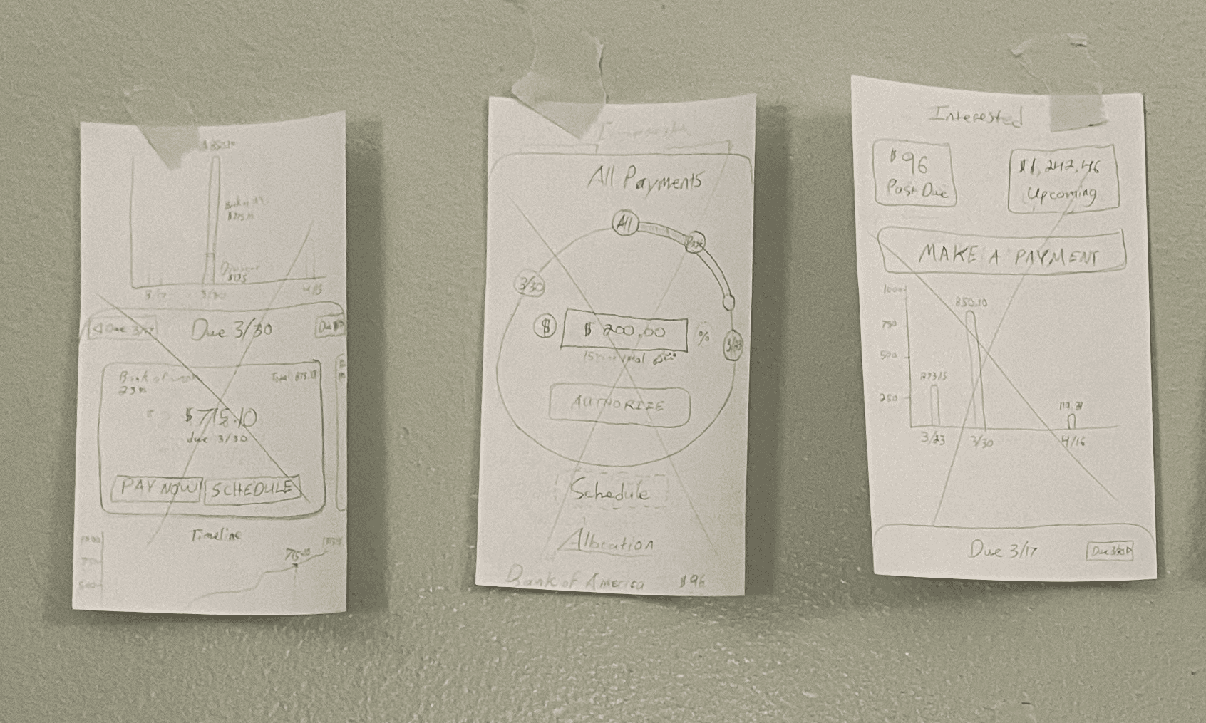
Fight Dark Patterns
The first iteration of the app focused on countering a dark pattern found among credit card companies: obscuring the interest cycle dates. My initial sketches and designs thus focused on pre-payment, helping users work within credit card billing cycles to understand exactly when interest would start accruing.
Title
I displayed spending in a generally upward graph assuming regular monthly card-usage, and staged repayments along a bar that would allow them to pay in advance of any charges. The goal here was to assist people who pay off their cards each month
Fight Dark Patterns
The first iteration of the app focused on countering a dark pattern found among credit card companies: obscuring the interest cycle dates. My initial sketches and designs thus focused on pre-payment, helping users work within credit card billing cycles to understand exactly when interest would begin to accrue.
The first iteration of the app focused on countering a dark pattern found among credit card companies: obscuring the interest cycle dates. My initial sketches and designs thus focused on pre-payment, helping users work within credit card billing cycles to understand exactly when interest would begin to accrue.
Title
I displayed spending in a generally upward graph assuming regular monthly card-usage, and staged repayments along a bar that would allow them to pay in advance of any charges. The goal here was to assist people who pay off their cards each month.
I displayed spending in a generally upward graph assuming regular monthly card-usage, and staged repayments along a bar that would allow them to pay in advance of any charges. The goal here was to assist people who pay off their cards each month.


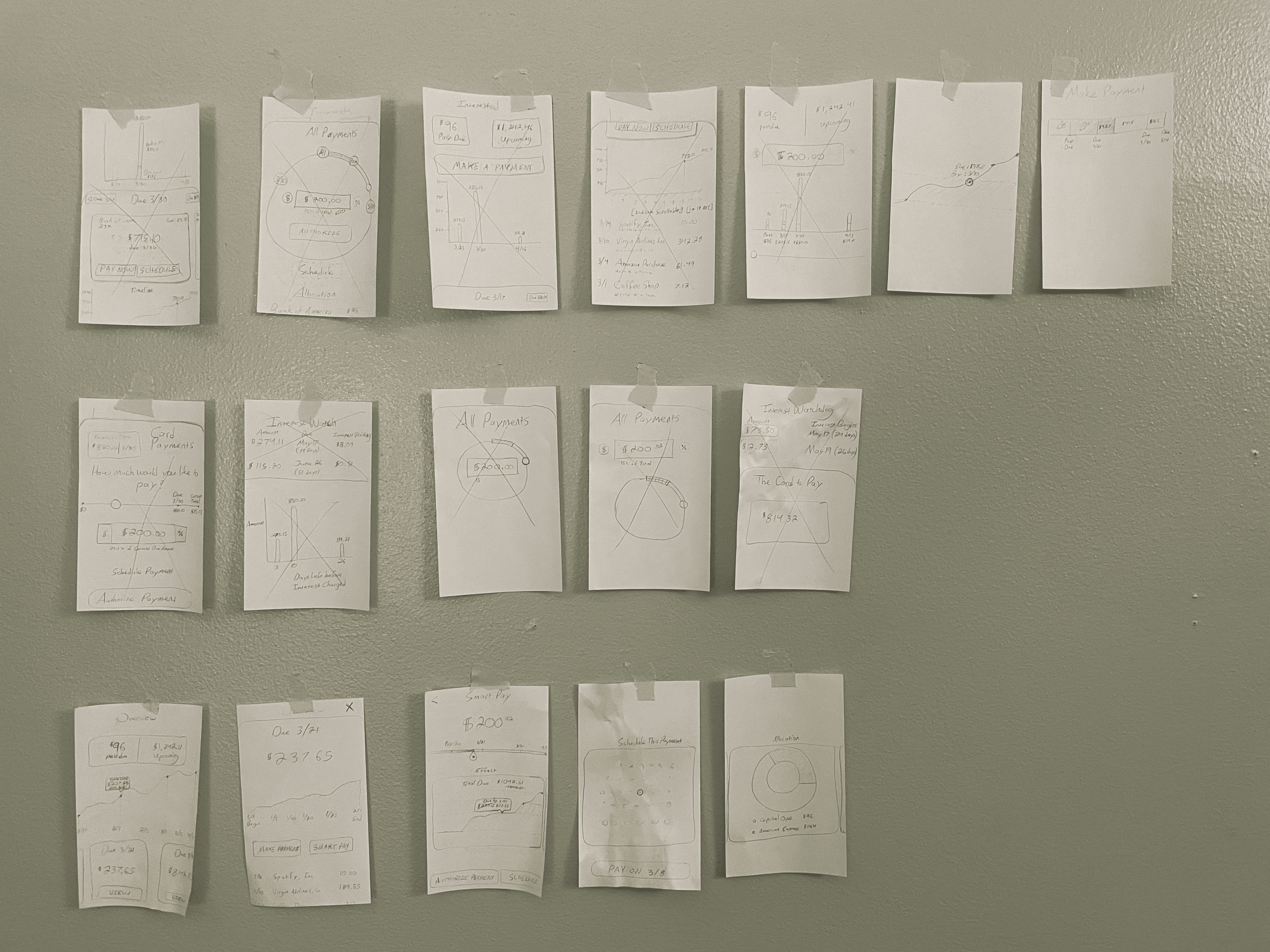
Early Sketches: Paper
For a completely blue-sky project I often start with pencil sketches. This allows me to quickly generate and sort many ideas. For new features within established systems, I usually sketch in Figma using existing resources.
Early Sketches: Figma
Early sketches with the beginnings of the visual hierarchy, high-saturation color scheme, and navigation patterns.
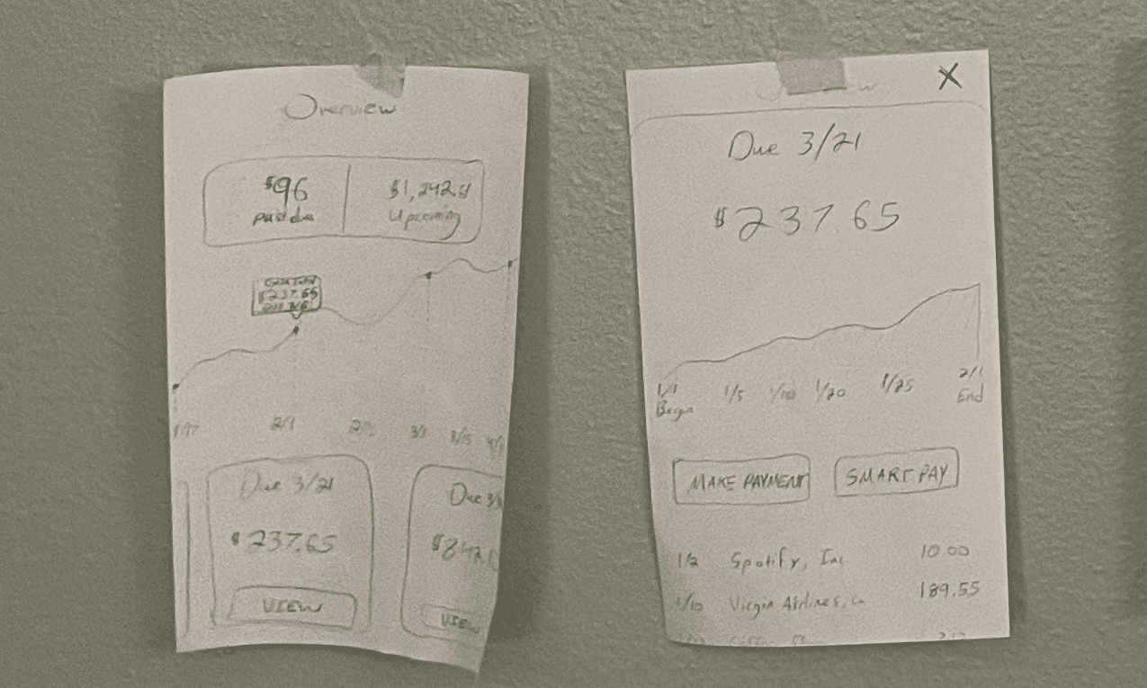
Early idea
Early designs focused on pre-payment, helping users work within credit card billing cycles to understand exactly when interest would start accruing.
Early idea
Early designs focused on pre-payment, helping users work within credit card billing cycles to understand exactly when interest would start accruing.
Research and Pivot
Research and Pivot
Addressing Demographic Needs
Having started with the idea to create a credit pre-payment app, during the second phase of the project I pivoted. I assessed the needs of people who are already pre-paying their credit cards, and realized that they have robust systems in place for avoiding interest.
Having started with the idea to create a credit pre-payment app, during the second phase of the project I pivoted. I assessed the needs of people who are already pre-paying their credit cards, and realized that they have robust systems in place for avoiding interest.
Title
The market for such users would be less than ideal. However, those who are already in steep debt do not have stable systems, and would benefit from the ability to largely outsource payment complexities to software. So I pivoted the project to concentrate on credit-debt repayment rather than prepayment. An app that allowed users to consolidate all payments into a single stream would reduce the complexity they could otherwise face, and alleviate stress in a difficult process.
The market for such users would be less than ideal. However, those who are already in steep debt do not have stable systems, and would benefit from the ability to largely outsource payment complexities to software. So I pivoted the project to concentrate on credit-debt repayment rather than prepayment. An app that allowed users to consolidate all payments into a single stream would reduce the complexity they could otherwise face, and alleviate stress in a difficult process.

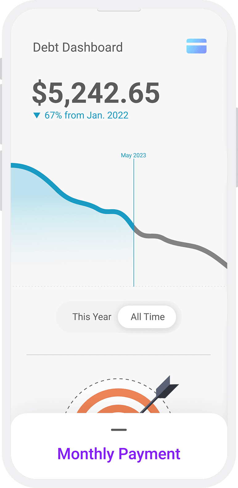
Intermediate Iterations
These drafts reflect the updated goal of the project, and display the characteristic "downward = good" graph of the debt dashboard. It incorporates the visual language of a skeuomorphic credit card, and shows early attempts to design the single-payment paradigm.
Color Scheme
I chose a bright, complimentary color scheme to make the app a more inviting experience.
reducing cognitive load
An app that allowed users to consolidate all payments into a single stream would reduce the complexity they could otherwise face, and alleviate stress in a difficult process.
reducing cognitive load
An app that allowed users to consolidate all payments into a single stream would reduce the complexity they could otherwise face, and alleviate stress in a difficult process.
Make it Deployable
Make it Deployable
Refine and Simplify
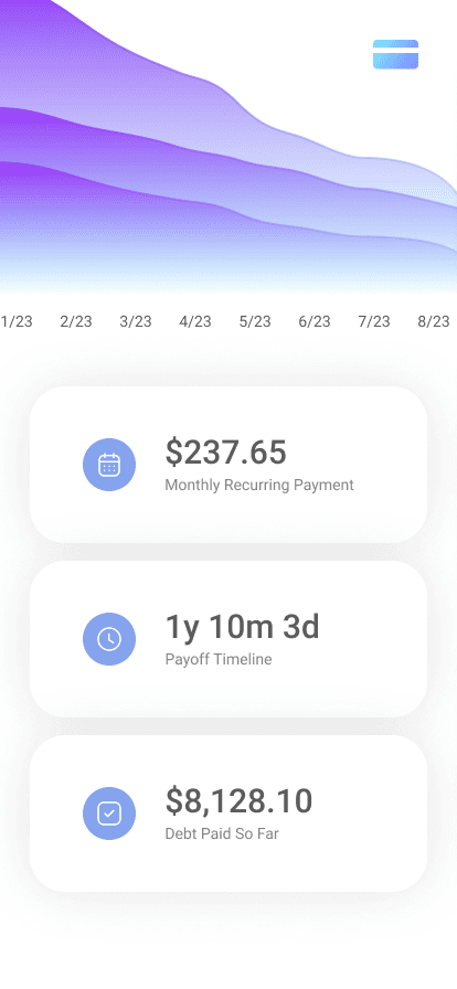
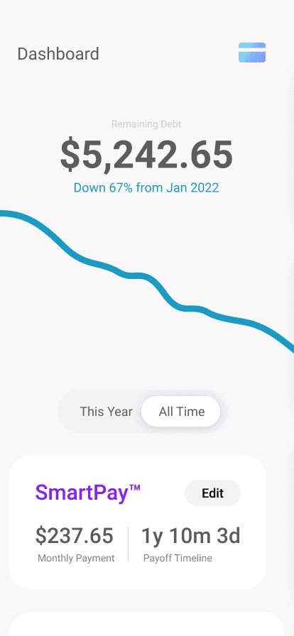
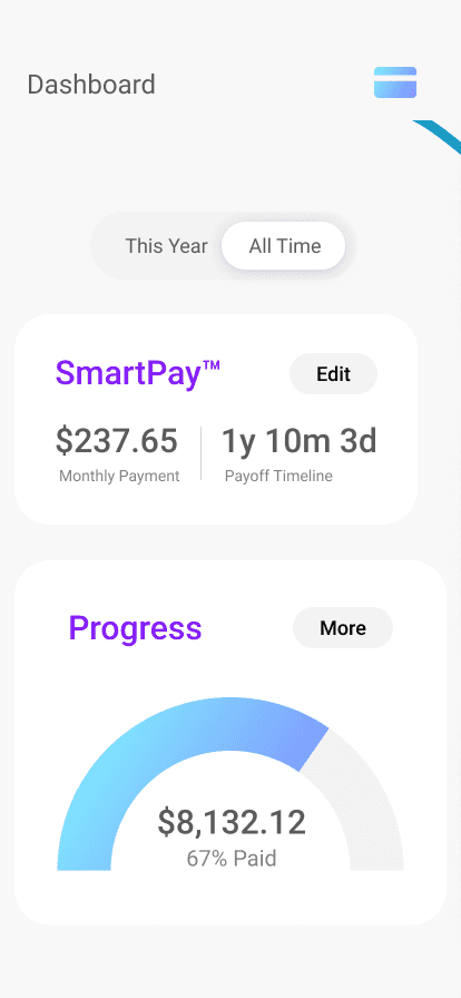
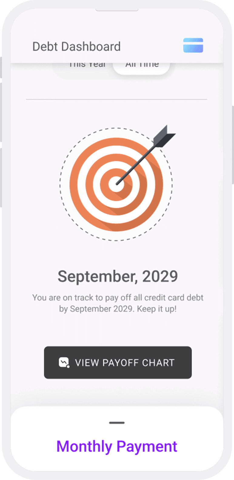
The final phase of the project involved aggressively simplifying the experience by stripping out all superfluous data. Does the final repayment date need equal weight with the monthly payment? Are multiple graph lines hurting or helping the user in understand their situation? How meaningful is a graph that indicates the total percentage that they have paid? Does the app need a navigation bar, or would that invite unnecessary complexity?
The final phase of the project involved aggressively simplifying the experience by stripping out all superfluous data. Does the final repayment date need equal weight with the monthly payment? Are multiple graph lines hurting or helping the user in understand their situation? How meaningful is a graph that indicates the total percentage that they have paid? Does the app need a navigation bar, or would that invite unnecessary complexity?
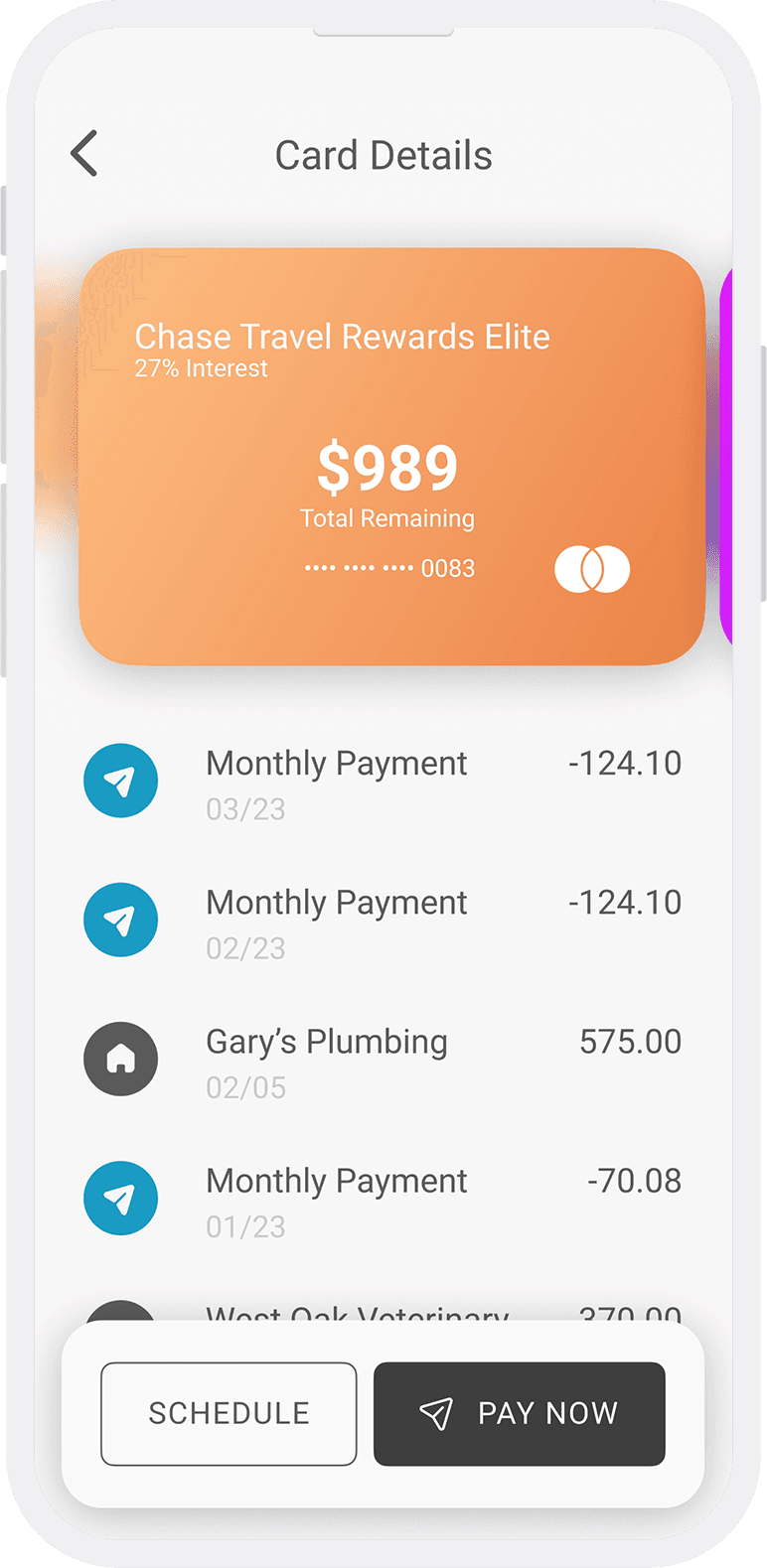
The last question was particularly difficult to answer. I opted not to use a navigation bar, instead emphasizing the monthly payment card as the primary affordance. The second highest priority became credit-card assessment: providing users with the ability to quickly view the balance on each of their cards, and get further details if they would like them. This resulted in an experience that would allow users to assess their situation quickly, and take immediate action.
The last question was particularly difficult to answer. I opted not to use a navigation bar, instead emphasizing the monthly payment card as the primary affordance. The second highest priority became credit-card assessment: providing users with the ability to quickly view the balance on each of their cards, and get further details if they would like them. This resulted in an experience that would allow users to assess their situation quickly, and take immediate action.
Refine and Simplify
The final phase of the project involved aggressively stripping out all superfluous data in order to simplify the experience. Do we need to prioritize the final repayment date on equal footing with the monthly payment? Are multiple graph lines hurting or helping the user in understand their situation? How meaningful is a graph that indicates the total percentage that they have paid, if a user could potentially accrue more debt and increase the total? Does the app need a navigation bar, or would that invite unnecessary complexity?
Title
The last question was particularly difficult to answer. I opted not to use a navigation bar, instead emphasizing the monthly payment as the primary affordance. The second highest priority became credit-card assessment: providing users with the ability to quickly view the balance on each of their cards, and get further details if they would like them. This resulted in an experience that allows users to assess their situation quickly, and take immediate action.
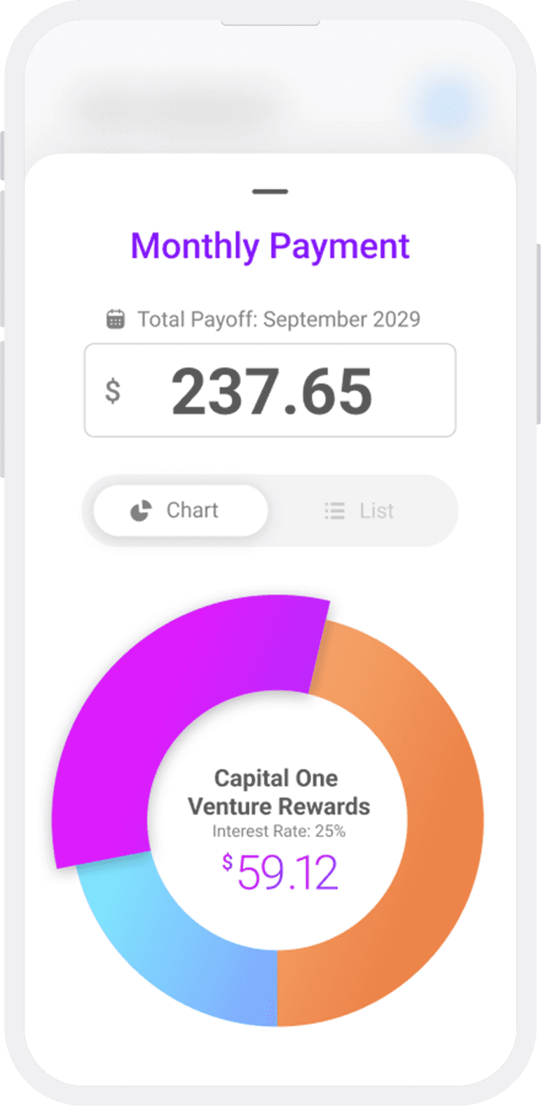


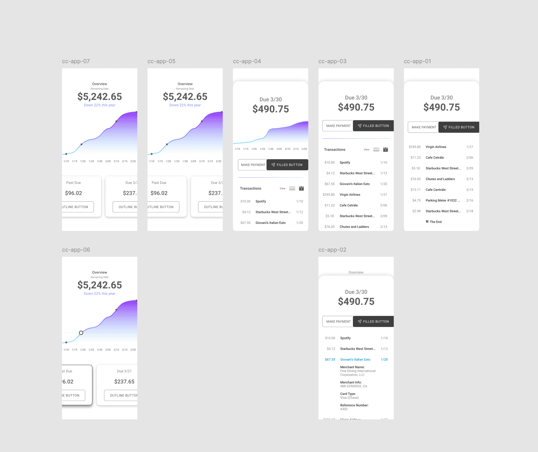
Final Drafts
These screens include a stronger monthly payment interface and more mature iteration of the statement view. The app uses a clear visual hierarchy, a bright complementary color scheme, and rewarding interactions. It is designed to simplify and invite rather than complicate and intimidate.
Meta: Design System
Meta: Design System
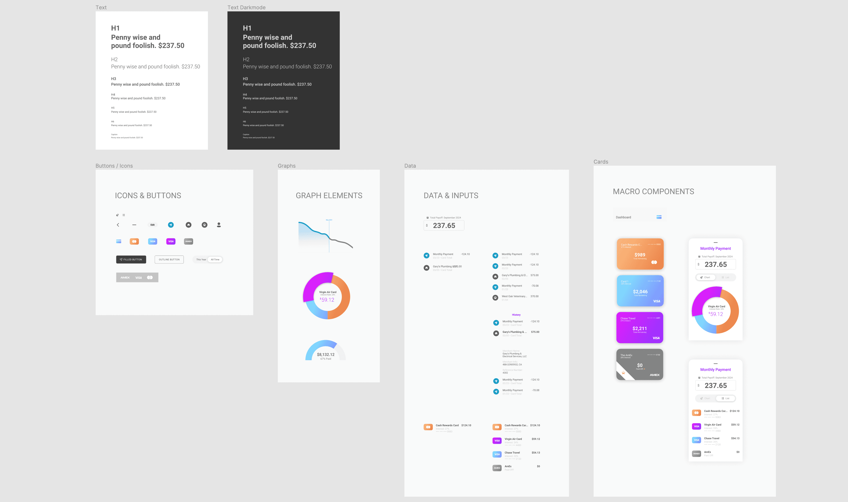
Small as the project was relative to a full-scale product, I still created and worked with a system. I also maintained a “graveyard” for decommissioned components to potentially make use of later, and an experimental page where I would break components down and rebuild them.
Small as the project was relative to a full-scale product, I still created and worked with a system. I also maintained a “graveyard” for decommissioned components to potentially make use of later, and an experimental page where I would break components down and rebuild them.
A Tiny Library
I created and used a design library for the project to maintain consistency.

Atomic Foundation
The Atomic design strategy tends to work well for libraries.
financial security
Addressing the consumer debt crisis with technology like this could promote greater financial security for millions of families.
financial security
Addressing the consumer debt crisis with technology like this could promote greater financial security for millions of families.
Future Opportunities
Future Opportunities
One Payment to Rule Them All
Consolidating credit payments helps people to more intuitively grasp their overall cashflow, which is important for long-term financial health. An app like this could expand by consolidating more and more payments under one roof. One day, it might be possible to have all outgoing expenses displayed in a simple interface that lets a user know how much “life per month” costs (or per week, or day). Doing so would present exciting design challenges, including the need to create a design language that could accommodate N number of payment categories while still maintaining the simplicity of one number to pay them all. Going further, a large enough company could even begin refinancing consumer debts in order to consolidate them into truly one payment.
Thank you for reviewing this design exercise!

One Payment to Rule Them All
Consolidating credit payments helps people to more intuitively grasp their overall cashflow, which is important for long-term financial health. An app like this could expand by consolidating more and more payments under one roof. One day, it might be possible to have all outgoing expenses displayed in a simple interface that lets a user know how much “life per month” costs (or per week, or day).
Title
Doing so would present unique design challenges, including the need to create a design language that could accommodate N payment categories while still maintaining the simplicity of one number to pay them all. Going further, a large enough company could even begin refinancing consumer debts in order to consolidate them into truly one payment.
Thank you for reviewing this design exercise! Please let me know if you have any questions.