
One Payment
A Mobile Credit Card Management Concept

Self-Initiated Design Challenge
Problem
Consumer debt in the United States can produce a dangerous cycle of poverty, and the general population is under-educated about the fundamentals of efficient repayment. After publishing this project, I noticed that Seema Amble et.al. wrote about the topic for Andreessen Horowitz, in “Who Will Build Consumers a Debt Dashboard?”. Without the ability to strategically allocate their repayments, many people are accruing heavy debts that they struggle to repay.
Solution
Software can easily assist with financial issues like this, allocating funds to reduce people’s debt loads in the most efficient way possible, accounting for changing variables like terms and interest. A simple app that consolidates all payments could help tremendously.
Design Challenge
An app for credit card debt would be a good start. But how can we create an interface that helps people understand what is happening without getting into overwhelming detail? It must be ultra-simple in order to streamline an otherwise stressful process, while also granting users greater clarity about their overall financial situation.
Preview: Outcome
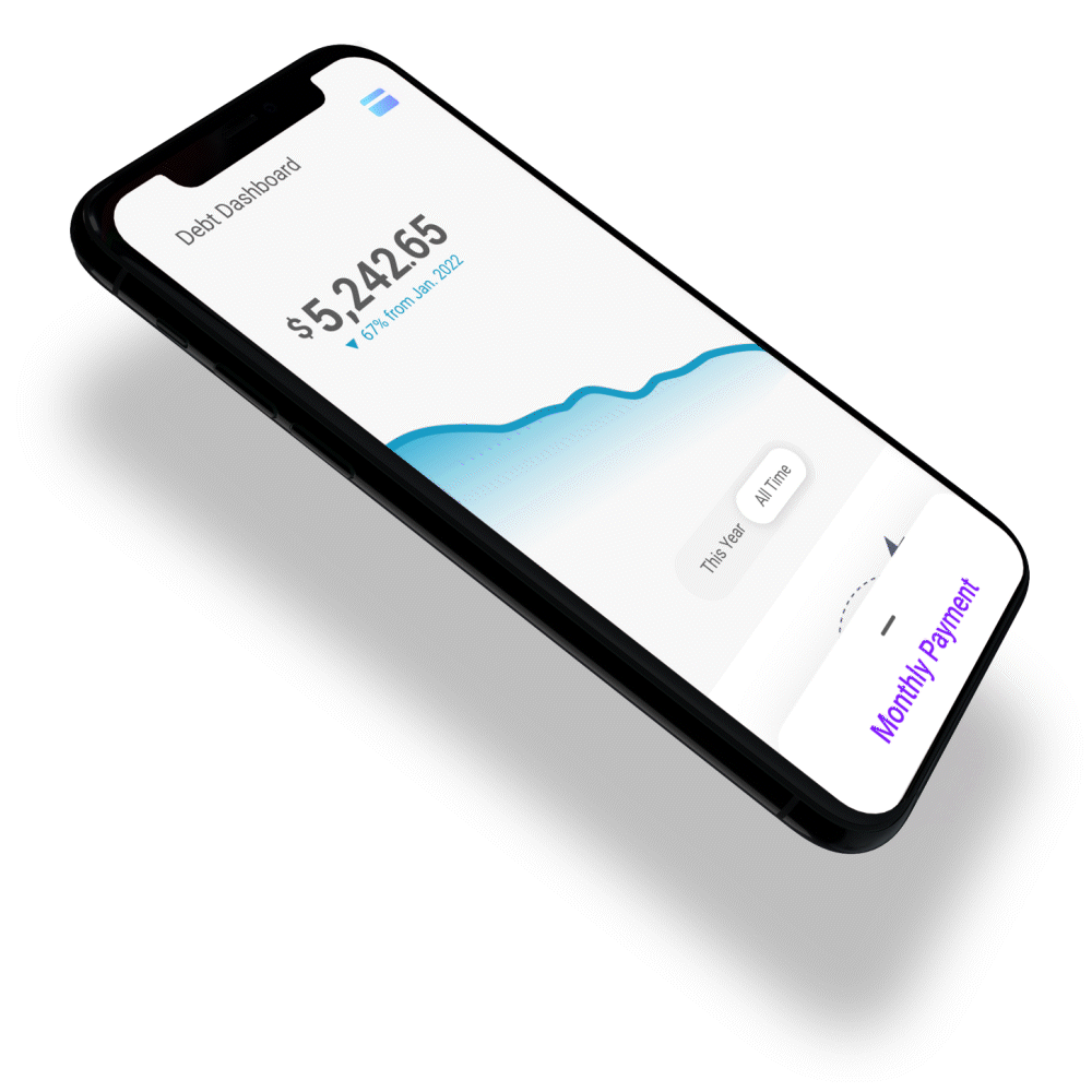
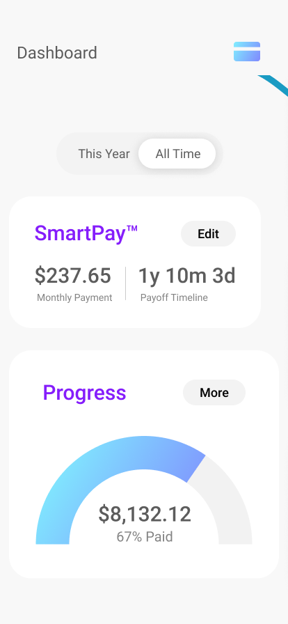
The One Payment concept is designed to afford users additional agency over credit debt repayments, consolidating all payments into one single number and automatically allocating the funds for greatest efficiency. It is differentiated from broad-scale financial apps like Mint and Emma through its simplicity, being designed to do one thing well. Through this consolidation, users will be able to more intuitively monitor their monthly cash flow and improve their financial situation. The interface prioritizes the most important actionable tasks—like adjusting the monthly payment and viewing the balance on each card, while providing a deeper dive into each account and providing individual payment affordances as desired.

Phase 1: Initial Sketches
Fight dark patterns
The first iteration of the app focused on countering a dark pattern found among credit card companies: obscuring the interest cycle dates. My initial sketches and designs thus focused on pre-payment, helping users work within credit card billing cycles to understand exactly when interest would start accruing. I displayed spending in a generally upward graph assuming regular monthly card-usage, and staged repayments along a bar that would allow them to pay in advance of any charges. The goal here was to assist people who pay off their cards each month


Phase 2: Research & Pivot
Addressing Demographic Needs
Having started with the idea to create a credit pre-payment app, during the second phase of the project I pivoted. I assessed the needs of people who are already pre-paying their credit cards, and realized that they have robust systems in place for avoiding interest. The market for such users would be less than ideal. However, those who are already in steep debt do not have stable systems, and would benefit from the ability to largely outsource the problem to software. So I pivoted the project to concentrate on credit-debt repayment rather than pre-payment. An app that allowed users to consolidate all payments into a single stream would reduce the complexity they could otherwise face, and alleviate stress in a difficult process.


Phase 3: Make it Deployable
Refine and Simplify
The final phase of the project involved aggressively stripping out all superfluous data in order to simplify the experience. Do we need to prioritize the final repayment date on equal footing with the monthly payment? Are multiple graph lines hurting or helping the user in understand their situation? How meaningful is a graph that indicates the total percentage that they have paid, if a user could potentially accrue more debt and increase the total? Does the app need a navigation bar, or would that invite unnecessary complexity? The last question was particularly difficult to answer. I opted not to use a navigation bar, instead emphasizing the monthly payment as the primary affordance. The second highest priority became credit-card assessment: providing users with the ability to quickly view the balance on each of their cards, and get further details if they would like them. This resulted in an experience that allows users to assess their situation quickly, and take immediate action.


Challenge Accepted
The design process resulted in a strong feature set that allows users to accomplish a meaningful goal in a short time: getting out of credit card debt with maximum interest-efficiency. It was a deceptively straightforward exercise, providing more challenges than anticipated with regard to simplifying the experience. I discarded several features that looked great in theory, but which would have added needless complexity, even down to the navigation bar (although it can be added later with an expanded feature set). Among those features that made the cut, I had to emphasize a strong hierarchy, subordinating the users’ financial data in favor of action. Many features are not represented (onboarding, edit profile, connect a new card, etc.) but those can be handled by common industry patterns. The affordances tackled here represent the most interesting design challenges from my perspective.

Meta: Methodology
Design systems are the best thing to happen to design since the Undo feature, and I created a system for this project based on Brad Frost’s Atomic Design methodology. In Figma, I created a small component library to facilitate efficient workflow, allowing me to make one change that can sweep across hundreds of instances. I also maintain a “graveyard” page for decommissioned parts in case I can make use of them later, and an experimental page where I break components down and rebuild them.
Future Potential
One Payment to Rule Them All
Consolidating payments helps people intuitively grasp their cashflow, which is important for long-term financial health. An app like this could expand by consolidating more and more payments under one roof. One day, it might be possible to have all outgoing expenses displayed in a simple interface that lets a user know how much “life per month” costs (or per week, or day). Doing so would present unique design challenges, including the need to create a design language that could accommodate N number of payment categories while still maintaining the simplicity of one number to pay them all. A large enough company could begin refinancing consumer debts in order to consolidate them into one actual payment.
Thank you for reviewing this design exercise! Please let me know if you have any questions.